「 IconButton の使い方を知りたい!」
本記事ではそんな要望にお答えします。
Flutter でアイコンをボタン化するWidget、
IconButton Widgetについて解説します。
Flutter 3.3 で追加されたMaterial3 対応についても解説していきます。
ぜひ読んでみて下さい!
基本的な使い方
IconButton Widgetの基本的な使い方について解説していきます。
IconButton Widgetは以下のようにして使用します。
IconButton(
  icon: const Icon(Icons.volume_up),
  onPressed: () {
    // ボタンが押された際の動作を記述する
  },
)
icon プロパティに設定したいアイコンをIcon Widgetにて設定します。
onPressedプロパティにて、アイコンが押された際の動作を設定します。
カスタマイズ
IconButton ウィジェットの iconSizeプロパティにてアイコンのサイズを変更することが可能です。
また、IconButton ウィジェットの colorプロパティにてアイコンの色を設定することが可能です。
IconButton ウィジェット のiconプロパティの
Iconウィジェットにてsizeとcolorを設定していた場合、
Iconウィジェットの設定が優先されます。
paddingプロパティでアイコン周りのpaddingを設定可能です。
また、splashRadiusプロパティにて、アイコンを押した時の波紋の大きさを設定可能です。
splashRadiusとpaddingを両方設定した場合、アイコンボタンが大きくなる方に設定されます。
splashRadiusは後述するMaterial3対応(`MaterialApp内でのuseMaterial3の有効化)
をすると、無効化されます。
Material3に対する対応
Flutter3.3で発表された、FlutterでのIconButtonのMaterial3対応について紹介します。
Material3 への対応項目として、2つ紹介します。
- デザイン反映のための
styleプロパティ - トグルボタン化のための
isSelectedとselectedIconプロパティ
Material 3のIconButtonについての記述は、こちらをご覧ください。
準備
Material3 をアプリで有効化するために、
MaterialApp内のthemeプロパティに追加するThemeDataにて、
useMaterial3プロパティをtrueにします。
また、Material3で追加されたダイナミックカラーでの色設定の代わりとして、
基準となる色をcolorSchemeSeedプロパティにて設定します。
MaterialApp(
      theme: ThemeData(
        colorSchemeSeed: const Color(0xff6750a4),
        useMaterial3: false,
      ),
      home: const MyHomePage(),
    );
デザイン反映
Material 3では標準とcontainedの2種類のボタンが存在します。
下記画像で、一番上が標準、下3つがcontainedです。
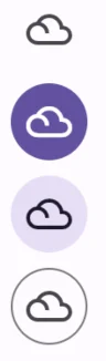
containedのIconButtonを実装するために設定するのが、
styleプロパティです。
styleプロパティにIconButton.styleFrom()を設定し、
styleFromの中で色などさまざまな設定を行うことで、
上記画像のボタンを実現可能となります。
上記画像の実装コードは以下の通りです。
@override
  Widget build(BuildContext context) {
    final ColorScheme colors = Theme.of(context).colorScheme;
    return Scaffold(
      appBar: AppBar(
        title: const Text('Icon Button Sample'),
      ),
      body: Center(
        child: Column(
          children: [
            // standard タイプ
            IconButton(icon: const Icon(Icons.filter_drama), onPressed: () {}),

            // 'Filled' タイプ
            IconButton(
                icon: const Icon(Icons.filter_drama),
                onPressed: () {},
                style: IconButton.styleFrom(
                  foregroundColor: colors.onPrimary,
                  backgroundColor: colors.primary,
                  disabledBackgroundColor: colors.onSurface.withOpacity(0.12),
                  hoverColor: colors.onPrimary.withOpacity(0.08),
                  focusColor: colors.onPrimary.withOpacity(0.12),
                  highlightColor: colors.onPrimary.withOpacity(0.12),
                )),

            // Filled Tonal タイプ
            IconButton(
              icon: const Icon(Icons.filter_drama),
              onPressed: () {},
              style: IconButton.styleFrom(
                foregroundColor: colors.onSecondaryContainer,
                backgroundColor: colors.secondaryContainer,
                disabledBackgroundColor: colors.onSurface.withOpacity(0.12),
                hoverColor: colors.onSecondaryContainer.withOpacity(0.08),
                focusColor: colors.onSecondaryContainer.withOpacity(0.12),
                highlightColor: colors.onSecondaryContainer.withOpacity(0.12),
              ),
            ),

            // 外形線タイプ
            IconButton(
              icon: const Icon(Icons.filter_drama),
              onPressed: () {},
              style: IconButton.styleFrom(
                focusColor: colors.onSurfaceVariant.withOpacity(0.12),
                highlightColor: colors.onSurface.withOpacity(0.12),
                side: BorderSide(color: colors.outline),
              ),
            ),
          ],
        ),
      ),
    );
}styledプロパティは前述のuseMaterial3を有効化した際にのみ設定が反映されます。
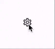
トグルボタン化
トグルボタン(ボタンを押したらボタンの色が変わるボタン)として
IconButtonを利用するのに有用なプロパティとして、
isSelectedとselectedIconプロパティがあります。
isSelectedプロパティにて、ボタンが選択されたかどうかを管理し、
selectedIconプロパティでisSelectedプロパティがtrueの際のアイコンを管理します。
設定例は以下のようになります。
class MyHomePage extends StatefulWidget {
  const MyHomePage({super.key});

  @override
  State createState() => _MyHomePageState();
}

class _MyHomePageState extends State {
  bool selected = false;
  @override
  Widget build(BuildContext context) {
    final ColorScheme colors = Theme.of(context).colorScheme;
    return Scaffold(
      appBar: AppBar(
        title: const Text('Icon Button Sample'),
      ),
      body: Center(
        child: IconButton(
          icon: const Icon(Icons.settings_outlined),
          onPressed: () {
            setState(() {
              selected = !selected;
            });
          },
          isSelected: selected,
          selectedIcon: const Icon(Icons.settings),
        ),
      ),
    );
  }
}
isSelectedとselectedIconプロパティは前述のuseMaterial3を有効化した際にのみ設定が反映されます。
まとめ
Flutter でアイコンをボタン化するWidget、
IconButton Widgetについて解説しました。
Flutter 3.3 で追加されたMaterial3 対応についても解説していきました。
いかがだったでしょうか?
こちらのページでは、 今回紹介した2つのMaterial3対応を組み合わせた場合のサンプルコードが紹介されています。 あわせてご確認ください。
本記事があなたのアプリ開発の一助となれば幸いです。
Flutterを一緒に学んでみませんか? Flutter エンジニアに特化した学習コミュニティ、Flutter大学への入会は、 以下の画像リンクから。
編集後記(2022/9/7)
ただ今、岐阜県高山市に来ています。
担当していた案件が一つ区切りを迎えたこともあり、 ワーケーションとして日本のいろいろなところを巡りながら仕事をしよう! と思い立ったからです。
記事を書く、という分には、 パソコン一台あればできるのがとても良いですね。
場所にとらわれずに色々な作業ができて、良さをとても感じています。
9月中旬まで色々なところを巡りながら 記事を書いていきます。
そちらも楽しみにしていただければ幸いです。
週刊Flutter大学では、Flutterに関する技術記事、Flutter大学についての紹介記事を投稿していきます。 記事の更新情報はFlutter大学Twitterにて告知します。
