
本記事ではそんな疑問にお答えします。
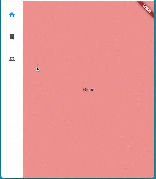
画面横側で画面遷移をコントロールする サイドメニュー を実装するWidget、
NavigationRail Widgetを紹介します。
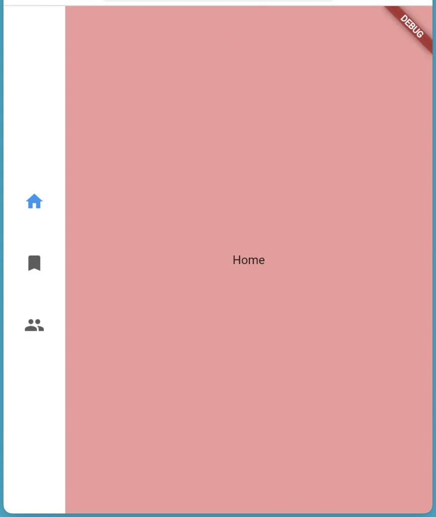
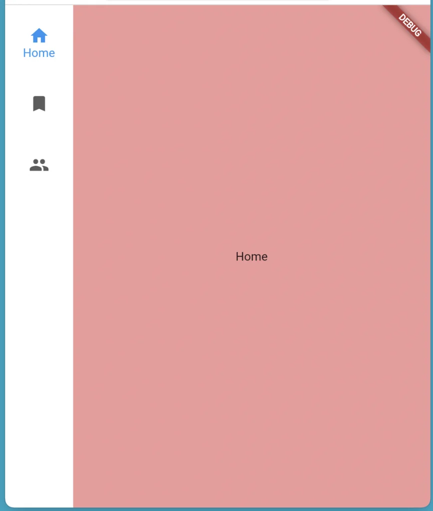
本記事を読めば以下のようなUIが作れます。
基本的な使い方から様々なプロパティの使い方まで紹介します。 ぜひ読んでみて下さい!
基本的な使い方

基本的な使い方は公式のYouTubeチャンネルでも紹介されています。 こちらもぜひ観てみてください。
基本的な使い方について解説していきます。
準備
StatefulWidget の用意
今回は簡略化のためにStatefulWidget でインデックスを切り替える方法にて解説します。
StatefulWidgetを継承したWidgetを用意し、状態としてint型のパラメータをもたせます。
class MyWidget extends StatefulWidget {
  const MyWidget({super.key});

  @override
  State createState() => _MyWidgetState();
}

class _MyWidgetState extends State {
  int _selectedIndex = 0;

// ・・・

}
表示する画面の用意
表示する画面を用意します。
今回はインデックスを受け取り、その値によって表示を変えるStatelessWidgetを用意します。
サンプルコードはこちら
class MainContents extends StatelessWidget {
  const MainContents({super.key, required this.index});

  final int index;

  @override
  Widget build(BuildContext context) {
    switch (index) {
      case 1:
        return Expanded(
          child: ColoredBox(
            color: Colors.blue[200]!,
            child: const Center(
              child: Text('Bookmark'),
            ),
          ),
        );
      case 2:
        return Expanded(
          child: ColoredBox(
            color: Colors.green[200]!,
            child: const Center(
              child: Text('Friends'),
            ),
          ),
        );
      default:
        return Expanded(
          child: ColoredBox(
            color: Colors.red[200]!,
            child: const Center(
              child: Text('Home'),
            ),
          ),
        );
    }
  }
}
NavigationRailの実装
Rowで並べる
NavigationRail Widgetと表示する画面のWidgetをRowで並べます。
class _MyWidgetState extends State {
  int _selectedIndex = 0;

  @override
  Widget build(BuildContext context) {
    return Scaffold(
      body: Row(
        children: [
          NavigationRail(
          // ・・・
          ),
          MainContents(index: _selectedIndex)
        ],
      ),
    );
  }
}
表示するアイコンを設定する
NavigationRailDestinationを使用し、
destinationsプロパティに画面表示するアイコンを設定します。
NavigationRail(
            destinations: const [
              NavigationRailDestination(
                icon: Icon(Icons.home),
                label: Text('Home'),
              ),
              NavigationRailDestination(
                icon: Icon(Icons.bookmark),
                label: Text('Bookmark'),
              ),
              NavigationRailDestination(
                icon: Icon(Icons.people),
                label: Text('Friends'),
              ),
            ],
            // ・・・
          ),
インデックス周りの設定
表示するインデックスの設定と、 アイコンが選択されたときに切り替わる処理を設定します。
表示するインデックスについてはselectedIndexプロパティにて、
切り替わる処理についてはonDestinationSelectedにて設定します。
NavigationRail(
            destinations: const [
            // ・・・
            ],
            selectedIndex: _selectedIndex,
            onDestinationSelected: (index) {
              setState(() {
                _selectedIndex = index;
              });
            },
          ),
以上で完成です!
完成したコードは以下にてご覧ください。
完成したコードはこちら
import 'package:flutter/material.dart';

void main() {
  runApp(const MyApp());
}

class MyApp extends StatelessWidget {
  const MyApp({super.key});

  @override
  Widget build(BuildContext context) {
    return const MaterialApp(
      home: MyWidget(),
    );
  }
}

class MyWidget extends StatefulWidget {
  const MyWidget({super.key});

  @override
  State createState() => _MyWidgetState();
}

class _MyWidgetState extends State {
  int _selectedIndex = 0;

  @override
  Widget build(BuildContext context) {
    return Scaffold(
      body: Row(
        children: [
          NavigationRail(
            destinations: const [
              NavigationRailDestination(
                icon: Icon(Icons.home),
                label: Text('Home'),
              ),
              NavigationRailDestination(
                icon: Icon(Icons.bookmark),
                label: Text('Bookmark'),
              ),
              NavigationRailDestination(
                icon: Icon(Icons.people),
                label: Text('Friends'),
              ),
            ],
            selectedIndex: _selectedIndex,
            onDestinationSelected: (index) {
              setState(() {
                _selectedIndex = index;
              });
            },
          ),
          MainContents(index: _selectedIndex)
        ],
      ),
    );
  }
}

class MainContents extends StatelessWidget {
  const MainContents({super.key, required this.index});

  final int index;

  @override
  Widget build(BuildContext context) {
    switch (index) {
      case 1:
        return Expanded(
          child: ColoredBox(
            color: Colors.blue[200]!,
            child: const Center(
              child: Text('Bookmark'),
            ),
          ),
        );
      case 2:
        return Expanded(
          child: ColoredBox(
            color: Colors.green[200]!,
            child: const Center(
              child: Text('Friends'),
            ),
          ),
        );
      default:
        return Expanded(
          child: ColoredBox(
            color: Colors.red[200]!,
            child: const Center(
              child: Text('Home'),
            ),
          ),
        );
    }
  }
}
プロパティの使い方

NavigationRailで設定できる項目(プロパティ)について、
いくつか紹介します。
NavigationRail全体に関する設定
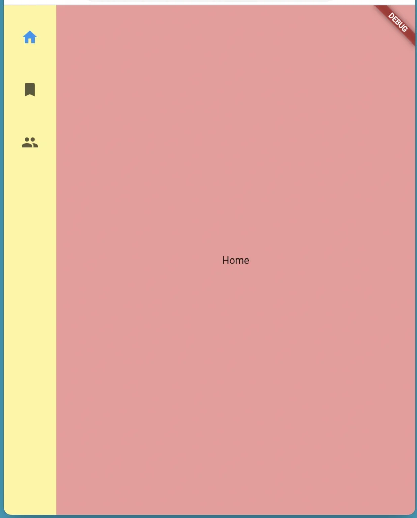
背景色
backgroundColor プロパティにてNavigationRailの背景色を変更することが可能です。
NavigationRail(
            // ・・・
            backgroundColor: Colors.yellow[200],
          ),
エレベーション
背景に対するNavigationRailの高さを設定することで、
NavigationRailの影の濃さを調整することができます。
NavigationRail(
            // ・・・
            elevation: 5,
          ),
RowでWidgetを並べている場合はElevationでの影が反映されません。
RowでなくStackで重ねる、
もしくはMainContents Widgetで色を指定するのでなく、
インデックスによりテーマカラーが変わるようにする、
等の対応が必要です。
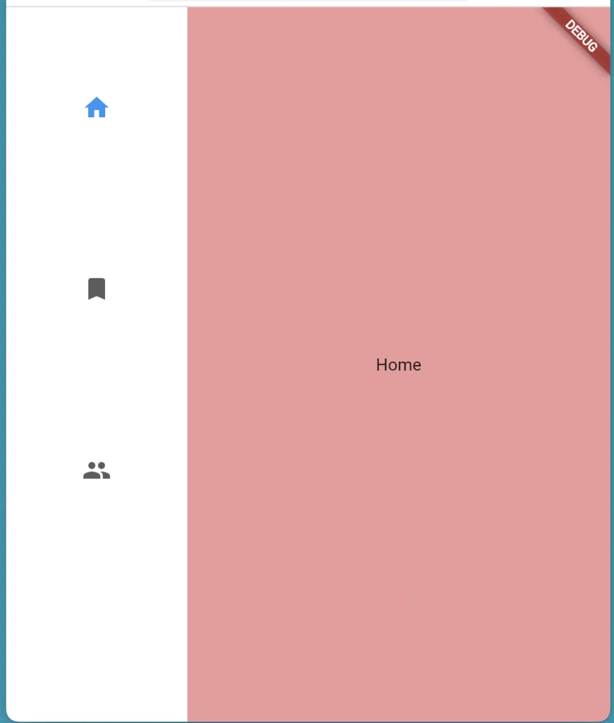
最小幅
minWidthプロパティにて NavigationRailの最小の幅を設定することが可能です。
NavigationRail(
            // ・・・
            minWidth: 150,
          ),
表示位置
groupAlignmentプロパティに-1 ~ 1の値を設定することで、
アイコンの表示位置を変更することが可能です。
(デフォルトは-1で、0で中央に配置されます。)
NavigationRail(
            // ・・・
            groupAlignment: 0,
          ),
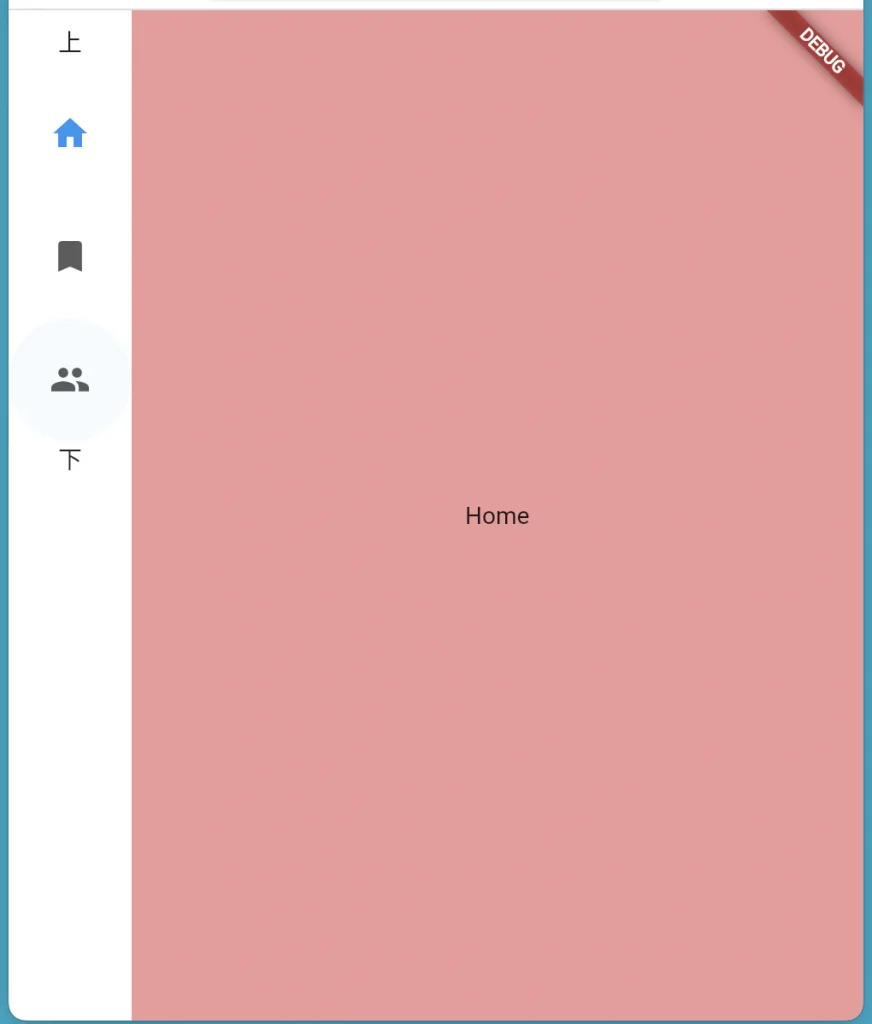
アイコン上下へのWidget の追加
leading プロパティにWidgetを設定することでアイコン上部に表示するWidgetを、
trailing プロパティにWidgetを設定することでアイコン下部に表示するWidgetを
それぞれ設定することが可能です。
NavigationRail(
            // ・・・
            leading: const Text('上'),
            trailing: const Text('下'),
          ),
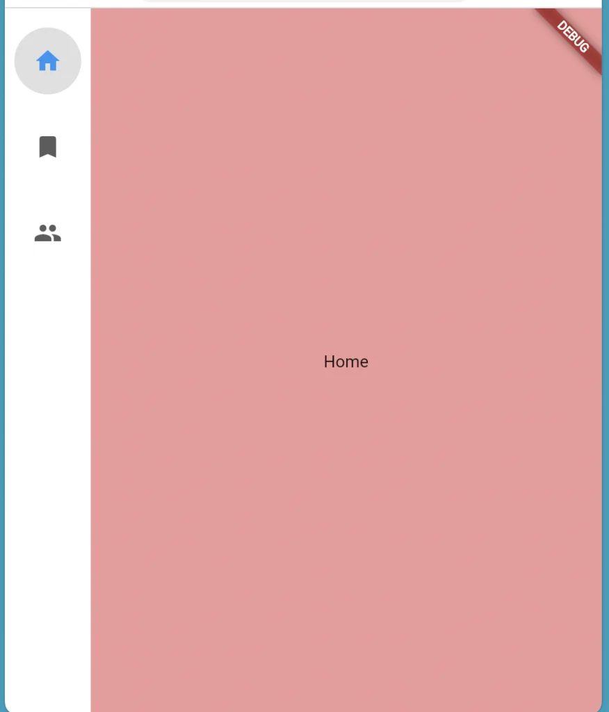
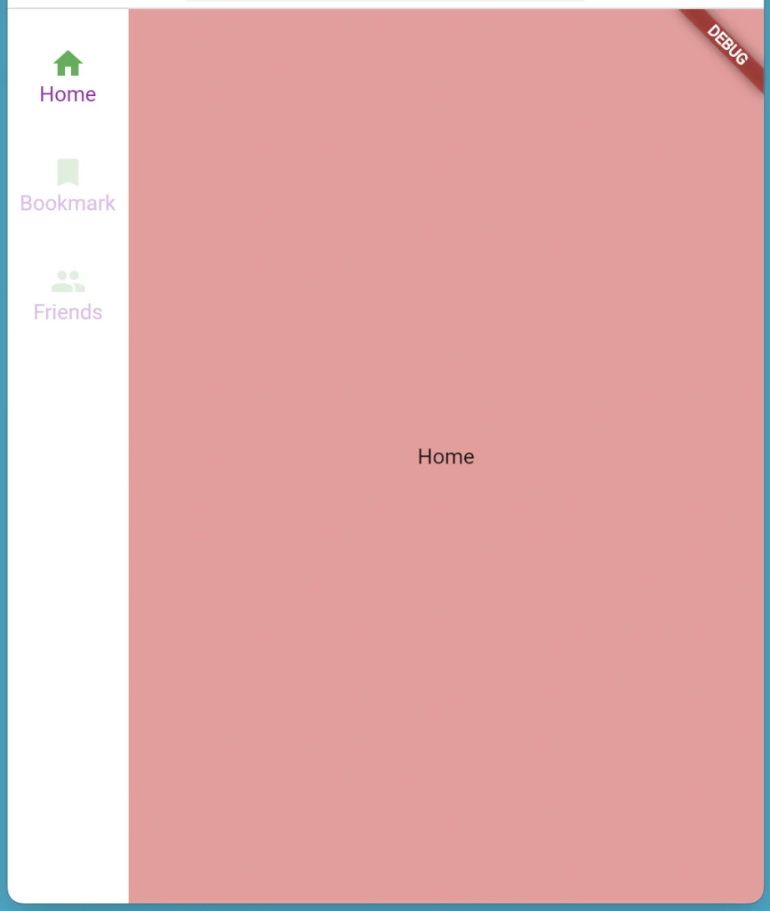
インディケーターの表示、色の設定
useIndicatorプロパティをtrueに設定することで、
選択しているアイコンをより目立たせるインディケーターを表示することができます。
indicatorColorプロパティでインディケーターの色を設定することが可能です。
NavigationRail(
            // ・・・
            useIndicator: true,
            indicatorColor: Colors.grey[300],
          ),
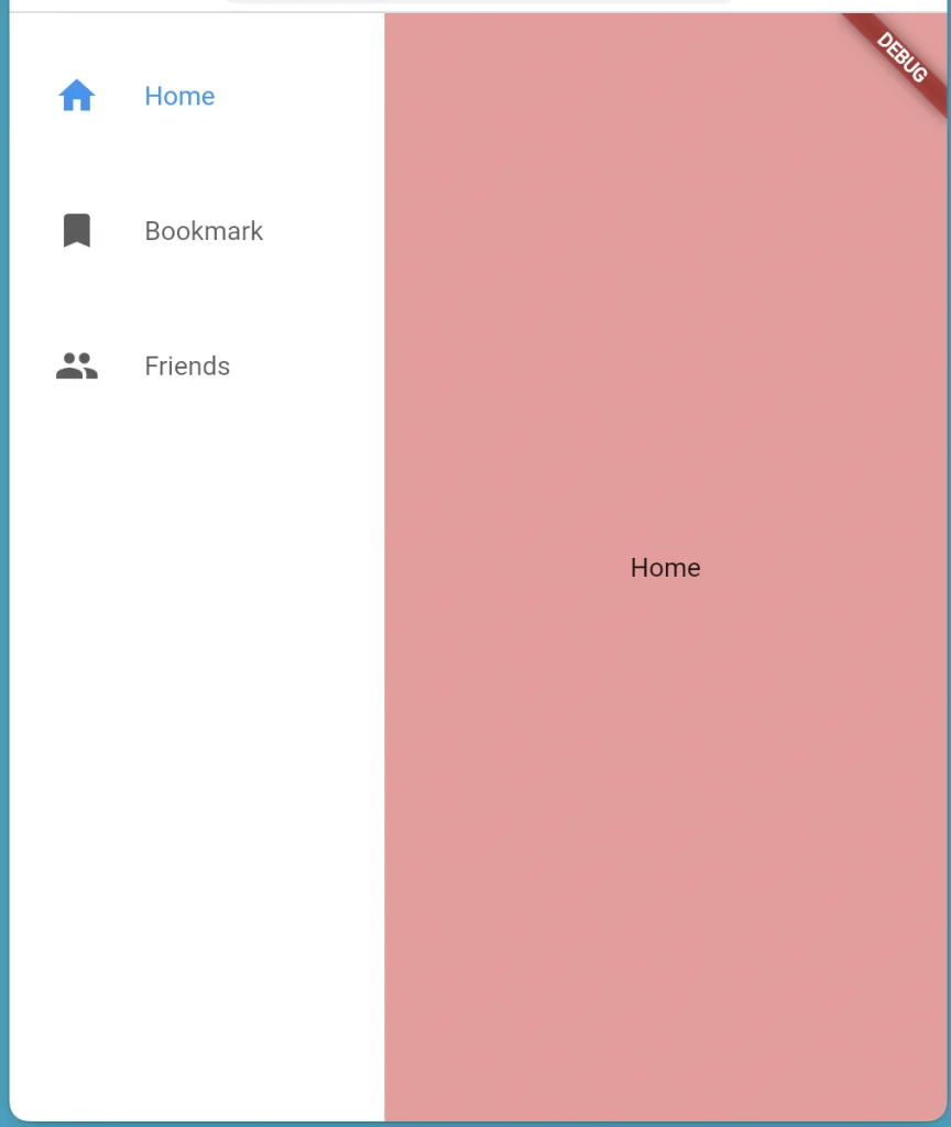
アイコンとラベル関連
アイコン横へのラベルの表示
extendedプロパティをtrueに設定することで、アイコン横にラベルを併記することが可能です。
この時の最小幅をminExtendedWidthにて設定可能です。
NavigationRail(
            // ・・・
            extended: true,
            minExtendedWidth: 200,
          ),
アイコン下へのラベルの表示
labelTypeプロパティに、
NavigationRailLabelType.allを設定すると常時、
NavigationRailLabelType.selectedを設定するとアイコン選択時に
ラベルをアイコン下部に表示することができます。
NavigationRail(
            // ・・・
            labelType: NavigationRailLabelType.selected,
          ),
アイコンとラベルのテーマ
selectedIconTheme にて、選択時のアイコンのテーマを、
selectedLabelTextStyle にて、選択時のラベルのテーマを設定することが可能です。
また、unselectedIconTheme にて、非選択時のアイコンのテーマを、
unselectedLabelTextStyle にて、非選択時のラベルのテーマを設定することが可能です。
NavigationRail(
            // ・・・
            labelType: NavigationRailLabelType.all,
            selectedIconTheme: const IconThemeData(color: Colors.green),
            selectedLabelTextStyle: const TextStyle(color: Colors.purple),
            unselectedIconTheme: IconThemeData(color: Colors.green[100]),
            unselectedLabelTextStyle: TextStyle(color: Colors.purple[100]),
          ),
まとめ

本記事では画面横側で画面遷移をコントロールする サイドメニュー を実装するWidget、
NavigationRail Widgetを紹介しました。
基本的な使い方から様々なプロパティの使い方まで紹介しました。
いかがだったでしょうか?
サイドメニューはTwitter(WEB)のUI等でも使われています。 使用してみるとワンランク上のデザインができるかもしれません。
ぜひ本記事を参考に使ってみて下さい!
本記事があなたのアプリ開発の一助となれば幸いです。
Flutterを一緒に学んでみませんか? Flutter エンジニアに特化した学習コミュニティ、Flutter大学への入会は、 以下の画像リンクから。
編集後記(2022/7/8)
NavigationRail Widgetについての記事でした。
この記事を書いていて改めて思ったのですが、 コードの変更がUIに即時反映されるのがめっちゃ楽しいですね。
「この色にしたらどうか?」や 「この配置にしたらどうか?」がすぐ検証できるのが、 パズルや積み木を遊んでいるようで、ものすごい楽しいです。
やっぱり目に見えるところに自分が作ったものができあがるのは、 これ以上無く楽しいですね。
遊ぶように勉強ができる環境というのは、大事にしていきたいです。
あなたもぜひWidgetのプロパティを色々と弄ってみて、
変更が即時反映される楽しさを味わってみて下さい。
週刊Flutter大学では、Flutterに関する技術記事、Flutter大学についての紹介記事を投稿していきます。 記事の更新情報はFlutter大学Twitterにて告知します。
